What Statistical Test To Use:
I memorized this table and wrote it out on my noteboard during the test. It makes it easy to pick out which test without much mental effort
| Type of Data | 2 Independent Samples “BETWEEN“ | Related or Paired Samples “WITHIN“ | 3 or More Independent Samples | 3 or More Related Samples | Measures of Correlation | Prediction or Association “PREDICT“ | Proportion Free of Events over time (survival) “TIME“ | Comparing 3 samples or more |
| Nominal Example: male/female, yes/no, dead/alive | Chi-Square / Fisher’s Exact (for small samples) | McNemar test | Chi-Square for K-independent t-samples / Fisher’s Exact | Cochran Q | contingency coefficient | Logistic Regression | Log-Rank | Bonferroni test of inequality |
| Ordinal Example: Class I, II, II Heart failure | Mann Whitney U / Willcoxen Rank Sum | Sign test / Willcoxen Signed Rank | Kruskal Wallis one way ANOVA | Friedman 2-way ANOVA | Spearman correlation, Kendell COE | Multinomial Logistic Regression | Cox Proportional Hazards | Student-Newman-Keul, Dunnet, Dunn |
| Continuous (aka “parametric”) Example: temperature, heart rate, blood pressure | Student T-test, Mann Whitney U (only if parametric with outliers) | Paired t-test | 1-way ANOVA (if confounders – ANCOVA) | 2-way ANOVA aka Repeated Measures ANOVA (if confounders repeated measures ANCOVA) | Pearson correlation | Linear Regression | Kaplan-Meier | Bonferroni, Tukey, Scheffe, Dunn, Dunnett, Student-Newman-Keul |
Quasi-experimental study designs are usually to evaluate services. they are faster and cheaper than rcts and have good external validity.
Types of biases:
- maturation bias; things get better over time
- hawthorne effect: things usually improve if people are studying them.
- selection bias
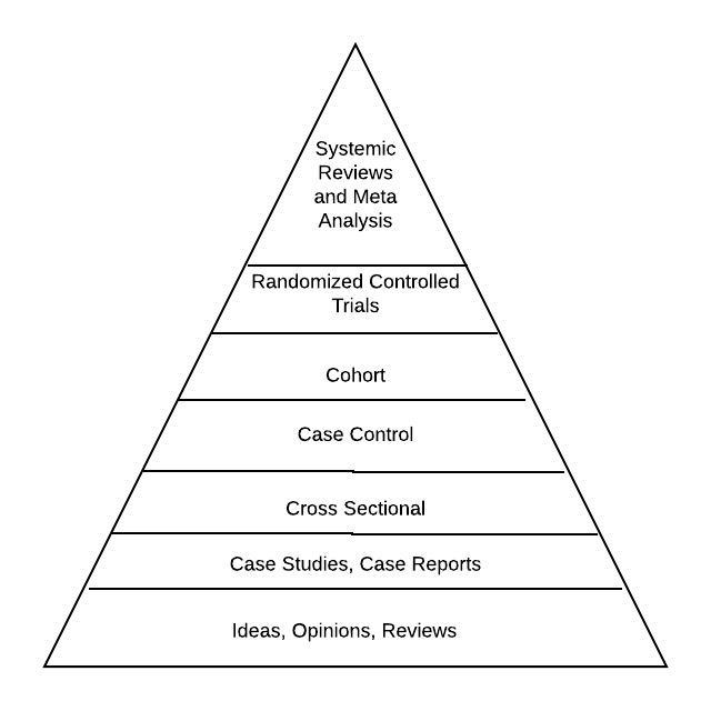
Study Type Strength or Weakness:

*Top is the highest quality, the bottom is the least
- Cohort and cross-sectional studies are usually prospective, case-control and case-report are usually retrospective.
- Cohort studies are best suited determining the association between exposures/factors and diseases/conditions (prospective. You follow a cohort and see if they get the disease).
- Case-control studies are best to determine the association between a rare event and a potential cause (retrospective. You see the rare event and work backward because the event is too rare to find in enough numbers in a random cohort).
- Cross-sectional studies are data collected from a population, or subset, at one specific point in time.
- Survival analysis – time to an event, not just death or MI, etc. Can be anything. Kaplan Meir curves estimate the percentage of people saved per time
Is it Intention to Treat or Per Protocol?
- Intention to treat: Analyze data from all randomized patients, regardless of completion of the trial. This increases external validity (is this applicable to the real world). In a non-inferiority trial, using ITT can bias you towards non-inferior because it essentially adds a placebo group to both arms. they usually analyze ITT and PP.
- Per-protocol: This increase internal validity (is this a well-done study for whatever the hypothesis is). Only count those who followed the trial to completion. The reflects the actual treatment, not real-world results.
Does it matter?
- POEMS patient oriented evidence that matters
- DOES disease oriented endpoints
How to Read a Forest Plot

The forest plot is a way researchers can summarize data from multiple papers in a single image, but they look a little weird. They’re valuable for looking at data when multiple studies have been done, especially if some have positive results and some have negative results. Cochrane systematic review often use Forest Plots as a visual display of the data.
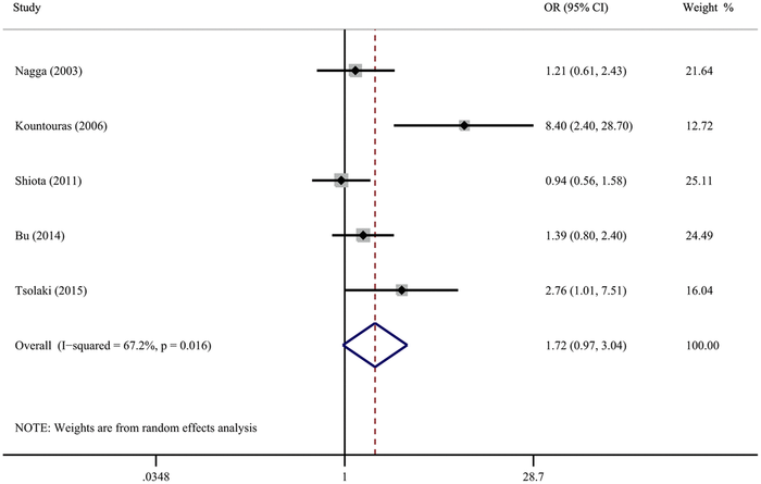
The forest plot featured is from an analysis looking at the association between Helicobacter pylori infection and the risk of Alzheimer’s disease.
The horizontal lines of a forest plot represent the statistics being studied. It’s can be a relative statistic like the odds ratio featured here, but it can also be absolute risk or risk reduction or anything else, as long as it’s the same statistic in each of the studies.
The vertical line is called the “line of null effect.” It’s placed at a value where there would be no association between the exposure and the outcome. NULL difference. In this case, it’s an odds ratio so the value is 1. For an absolute risk reduction, it would be 0.
The actual “forest” is made of the studies being reviewed,
- Each horizontal line is a separate study, Our meta-analysis above has five studies. Those are usually labeled by author and date on the left and data on the right.
- The black boxes reflect the weight of the studies. The size of the square represents the weight contributed by each study in the meta-analysis. The bigger the box, the more weight it contributed. The size of the box is usually determined by the number of patients or the sample size.
- The solid black horizontal lines represent the 95% confidence intervals of the study result. The endpoints are the max and min for those confidence intervals.
- The significance of left and the right of the null line will differ between studies so pay careful attention to what the authors are trying to show. In our example, the left of the null is an increased risk of dementia.
- The diamond on the forest plot represents the point estimate/population estimate and confidence intervals when you combine and average all the individual studies. It’s often called the “pooled” ratio or effect.
- I-2 or I2 is how consistent all the studies are with each other/heterogeneity.
- The dashed vertical line is drawn from the center of the diamond and represents the overall pooled estimate. It is a visual assessment of heterogeneity of the studies. If it crosses every included study, it’s a good indication that are homogenic.
The horizontal lines for each study can be analyzed like we analyze any confidence ratio. If the line crosses the null (ie: no difference is within the range of possible values for the true value), then the study isn’t significant (1 for ratio values, 0 for absolute values). In our example, 3 studies cross the null, which means they aren’t significant for this forest plot. Narrower confidence intervals or shorter lines mean the same thing here as with any study: the estimated value is relatively stable.
The confidence interval of the diamond should be the smaller confidence interval since it combines all the values. If the diamond crosses the null, it’s probably not statistically significant.
It also is important to consider to what extent the results of studies are consistent. If the confidence intervals for the results of individual studies have poor overlap, this generally indicates they aren’t similar enough to be compared. The vertical line coming from the diamond is a good way to visually see that. More formally, a statistical test for heterogeneity is available (I-2 or I2). It assesses whether observed differences in results are compatible with chance alone.
Thresholds for the interpretation of I2 can be misleading since the importance of inconsistency depends on several factors. A rough guide to interpretation is as follows:
- 0% to 40%: might not be important;
- 30% to 60%: may represent moderate heterogeneity*;
- 50% to 90%: may represent substantial heterogeneity*;
- 75% to 100%: considerable heterogeneity*.
In our example, I-2 is reported as 67.2%, so it’s not great. Usually, less than 50% is considered ideal.
The researchers in our example review suggested that H. pylori infection may be associated with an increased risk of all-cause dementia, but not AD dementia.
Non-inferiority
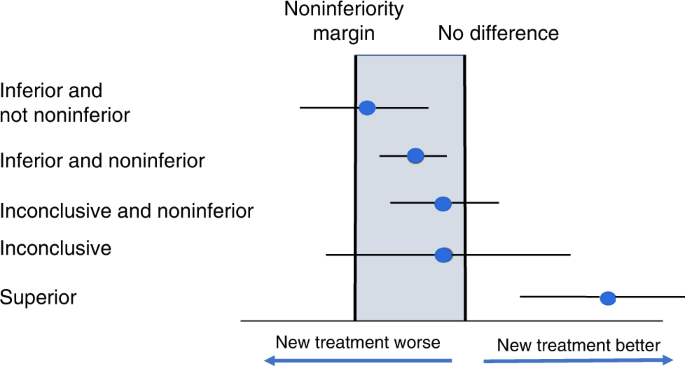
A non-INFERIORIty trial has a forest plot with two lines. One is the line of superiority (or superior line of unity) and the other is your delta, or non-inferiority margin. The entire confidence level must be to the better side of the delta line for the study to be non-inferior. In the study below, that’s to the right of delta. “Better” can be to the left depending on how the study is laid out. Two of the studies below are non noninferior, even though the wide confidence interval of one crosses the line of superiority.
That wide confidence interval means we don’t know where the true value lies.

